CSS sprites is the name of the technique used to load one single image that contains several graphics that will be used on a web page, game or any other computer application.
In other words, when you have many images to be used, instead of having them as different individual files, we combine them into one.
Therefore, the client computer only downloads one image for all the different graphics to be displayed.
Benefits of CSS sprites
Using CSS sprite images on your website is the best way to quicken up the loading time of your images and is also the best way to keep up with today's best web design practices.
CSS sprites decrease the loading time of images on your web pages, period.
Plus, the best looking sites out there are using CSS sprites too i.e., Apple, etc, ;).
Materials Needed:
- A navigation menu (with multiple states other than the normal state, you may download the sample).
- Measuring application (err, you can try with a real-life ruler but Photoshop, Slammer or XScope would be better).
- A code editor (preferably, Notepad++ on Windows or TextWrangler on Mac, both free. I used both TextWrangler and Coda).
Got everything you need?
Now, let's get rid of those heavy Dreamweaver-default onmouseout="MM_swapImgRestore()" Javascripts!
Bear with the vocabs
"Navigation bars" and "navigation menus" mean the same.
"Images" and "graphics" mean the same.
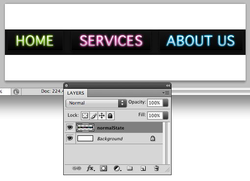
Image - Step 1: Set up each individual navigation menu image states
Since this tutorial is not focused on designing beautiful navigation bars, we'll use pre-made ones. Don't worry, there are plenty of Photoshop tutorials on Tutorial9 to teach you that, browse around!
Need a pretty navigation bar?
Download the source files here.
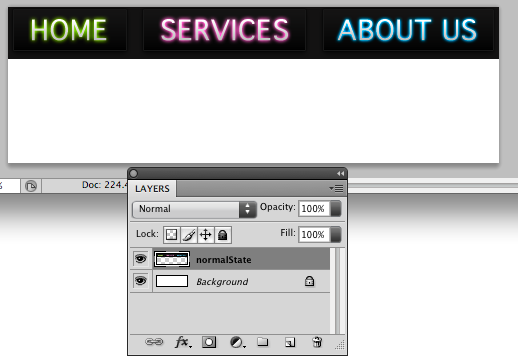
In the source files, there are 3 separate files for the navigation bar's normal state, hover/rollover state and clicked state.
We'll teach you how to combine them yourself in the next step. But you can always use the one combined image of all 3 states provided in the source files.
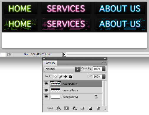
Step 2: Image - Combine all 3 navigation bar image states into 1 image
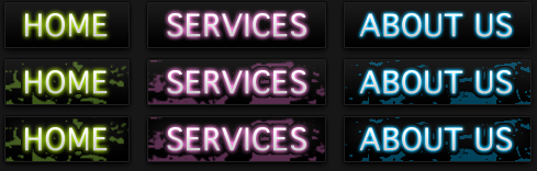
Right now, we have 3 separate PNG files for the 3 different states. It's time to copy-paste them together into 1 image just as shown above.
A personal tip.
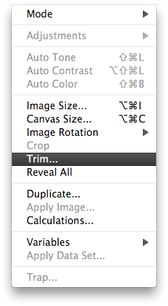
Usually, what I like to do in this step is (in Photoshop) make the background invisible so that all you have left are the buttons themselves like this:
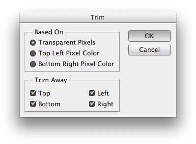
Then, I go to Image > Trim:
Select Transparent Pixels and check all the sides to trim away:
So, now, you have a concise image of the buttons, nothing else. (Note that I made the background visible here):

Now that we've trimmed away correctly all the 3 states, let's merge them into 1 image.
There is no standard way of doing this, you may be used to your own way of copy pasting but for the sake of example, start by opening up the normal state then press CTRL or CMD + a (select all) and CTRL or CMD + a (copy)just like below.

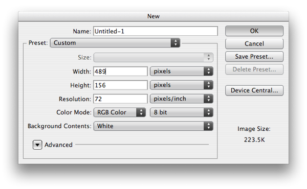
Create new document (CTRL or CMD + n).
Copy pasting tip
We copied the navigation bar before making the new document so that Photoshop will automatically know the width and height of the navigation bar.
You can see from the new document panel that the height of one navigation bar is 52. Since we'd like to put 3 states in this document, that's 52 * 3 = 156.
So let's change the height of this new document to 156.
Then, paste the normal state of the navigation bar into the new document.
Move it to the very top of the document.
Repeat this process 2 more times or according to the number navigation bar states you have.
Paste and align the hover state of the navigation bar right below the normal state.
Lastly, paste and align the clicked state of the navigation bar right below the hover state.
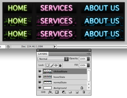
If you have aligned all 3 states correctly, they will fit into the new 489 x 52 document perfectly just like so:
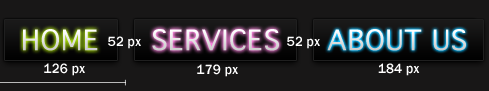
Step 3: Image - Measure the height of each buttons
Important: Get something to write on, whether a new text file on screen or a piece of paper for this next step 'cause we'll need to write down the width and height for each button.
To easily determine the height of the buttons, we can look back on the height of each navigation bar for obvious reasons.
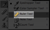
Tip for measuring in Photoshop
Use the Ruler Tool in Photoshop to easily measure things in your document.
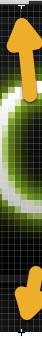
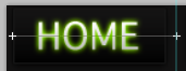
In the screenshot below, the Ruler Tool is used to measure the height of the Home button.
Also, move the navigation bar below the navigation bar you want to measure one pixel down to see its edge.
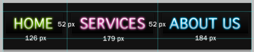
After measuring the height of the buttons, we now know the height of each button is 52px.
And since all of the buttons have the same height, all of the buttons will all be 52px.
Step 4: Image - Measure the width of each buttons
Now, to measure the width of each buttons is a bit more complicated.
As mentioned above, the horizontal gap between each buttons should preferably be even so that when you divide the gap width into 2, one side will not be wider than the other. This is optional, though.
Here the width of the gap between each button is 16px.

When divided into 2 sides, each side of the gap will be 8px.
Tip to keep measurements in Photoshop
Make sure you have Rulers turned on (cmd + r) or go to View > Rulers.
Then, click on the vertical ruler and drag out a guide to the point where you would want your button to end.
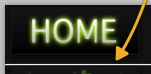
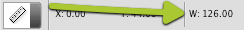
Now that you know how wide your Home button will be, let's measure it.
Use the Ruler tool again and measure from the left edge of the Home button to the guide we made as shown in the last tip, like this:
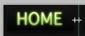
You can see the width in the Ruler tool panel:
Repeat the same process for all the other 2 buttons.
Step 5: Image - Width and height of each buttons
Step 6: CSS - setting up the navigation bar
Here comes the coding! I hope you already understand a bit of CSS and HTML. If not, then you can just go 'head and copy-paste the codes below, :P.
First let's create a DIV for our navigation bar in our HTML document and name it "navBarContainer".
<div id="navBarContainer">
</div>
Now, let's style this DIV in an external CSS stylesheet.
Linking an external CSS stylesheet to an HTML document
Put this line of code into the <head> tag of your document:
<link rel="stylesheet" type="text/css" media="screen" href="stylesheet_name.css" />
Like this:
<html>
    <head>
        <link rel="stylesheet" type="text/css" media="screen" href="stylesheet_name.css" />
    </head>
</html>
Continuing on with styling the "navBarContainer" DIV.
In the external CSS, let's write down the width, height and margin of the DIV that contains this navigation bar. It's very easy to do so since we've already determined the width and height before.
#navBarContainer{
    width: 489px;
    height: 52px;
    margin: 0 auto;
}
Note: the height for the navigation bar is 52 pixels tall, not 156 pixels. This is because we'd like to show only one navigation bar at a time.
Next, we'll show how to use HTML lists to display links. This is a much more structured way for links.
Step 8: CSS - Using HTML lists (ul tags) for the navigation bar links
Let's continue to code our HTML document.
We'll now add the lists for each link:
<div id="navBarContainer">
<ul id="navBar">
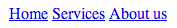
<li id="navBarHome"><a href="#">Home</a></li>
<li id="navBarServices"><a href="#">Services</a></li>
<li id="navBarAboutus"><a href="#">About us</a></li>
</ul>
</div>
By default, HTML lists are structured on display as vertical bullets.
To make them flow horizontally, we'll use "none" for the "list-style" attribute. We'll also have to use "inline" for the "display" attribute.
ul#navBar{
	width: 489px;
	height: 52px;
	margin: 0 auto;
	list-style: none;
}

ul#navBar li{
	display: inline;
}
So, instead of this:

We have this:
Step 9: CSS - adding images for each links
This first step is useful to still display the links as text whenever CSS has been turned off in browsers and the images aren't available.
Add this code to do so:
ul#navBar li a{
	height: 52px;
	float: left;
	text-indent: -9999px;
}
The "-9999px" was not a typo, this is too keep the text links off the screen if CSS is turned on. If not then the text links would overlap the navigation bar images.
Now to display some image for the home link!
ul#navBar li#navBarHome a{
	width: 126px;
	background: url(neonBlackNavBar.png) no-repeat 0px 0px;
}
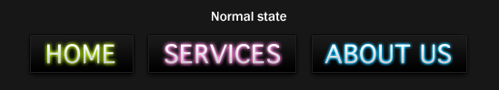
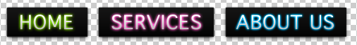
Ta-da! Our first link is set up:
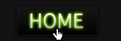
By the way, we changed our body background to #131313.
For the other 2 buttons, we apply the same codes but we change their background positions and widths.
Here's the code for the "Services" button:
ul#navBar li#navBarServices a{
	width: 179px;
	background: url(neonBlackNavBar.png) no-repeat -126px 0px;
}
"WAIT! How'd you get that "-126px"?! Good question.
Since we used a sprite image, we need to 'cut' the images inside the sprite image.
We do this by specifying the background position.
Since the "Home" button x-axis was at 0px, the "Services" button (obviously, come on! :D) must begin where the "Home" button ended. And that is 126 pixels.
Now, here's the code for the "About us" button:
ul#navBar li#navBarAboutus a{
	width: 184px;
	background: url(neonBlackNavBar.png) no-repeat -179px 0px;
}
And we're done!
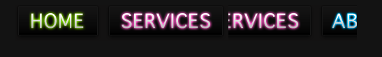
Actually, no we're not done, the image above is a pitfall.
The "About us" button does not start at -179px just because the "Services" button ended there.
The correct calculation is (width of "About us" button) + (width of "Services" button). Therefore, the "About us" button begins at -305px.
Now, we're truly done, I promise.

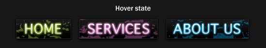
Step 10: CSS - adding hover states to the navigation bar
Adding hover states owns the same principle as adding the other 2 links. We just move their background positions.
For the "Home" button, we simply move its y-axis background position to where the normal state navigation bar ended, like so:
ul#navBar li#navBarHome a:hover{
	background-position: 0 -52px;
}
Now, when you hover over the "Home" button, you'll see its hover state.

Let's apply the same principles to the "Services" button.
ul#navBar li#navBarServices a:hover{
	background: url(neonBlackNavBar.png) no-repeat -126px -52px;
}
We'll get this:

Lastly, to the "About us" button.
ul#navBar li#navBarAboutus a:hover{
	background: url(neonBlackNavBar.png) no-repeat -305px -52px;
}
Preview:

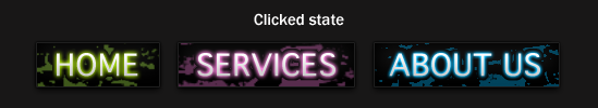
Step 11: CSS - adding clicked/active states to the navigation bar
Given the keyword "active" for clicked link states, I really, REALLY hope you can already do this part yourself.
Here are the codes for the hover states for all 3 links:
ul#navBar li#navBarHome a:active{
	background-position: 0 -104px;
}

ul#navBar li#navBarServices a:active{
	background: url(neonBlackNavBar.png) no-repeat -126px -104px;
}

ul#navBar li#navBarAboutus a:active{
	background: url(neonBlackNavBar.png) no-repeat -305px -104px;
}